Warm Colors Range From Sunny Yellows to Luscious Reds

By: Talon Homer  | 
gradient of yellow, orange, and red tones
From a sunny yellow to a smoldering maroon, warm colors evoke a sense of energy. Kilito Chan / Getty Images

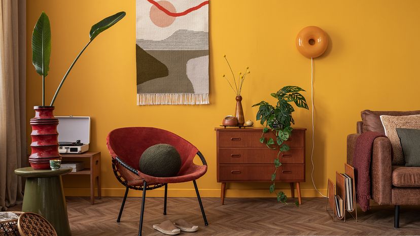
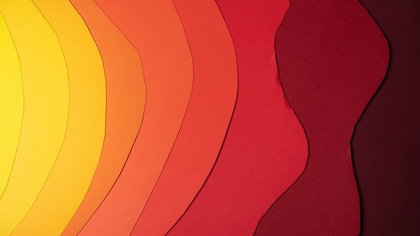
Warm colors — including reds, oranges and yellows — evoke feelings of energy, passion and warmth. Warm and cool colors play off each other, with warm tones taking center stage when you want to create a lively, inviting atmosphere.

Think about a glowing sunset or a crackling fire: That's the essence of warm colors in action.

Advertisement

But it's not just about their fiery nature. Warm colors can be bold or muted, making them versatile for all kinds of designs. Whether you're decorating a room, choosing an outfit or branding a product, warm color palettes are an easy trick to bring in comfort and excitement while pairing beautifully with cool tones for balance.

The Science Behind Warm and Cool Colors

On the color wheel, warm colors occupy one side, ranging from red to yellow, with hues like orange and brown in between. These colors are associated with long wavelengths of light, which makes them appear vibrant and more stimulating. That's why warm tones feel energizing and attention-grabbing.

Warm or cool color perception can change based on lighting. Under natural light, warm colors retain their vibrancy, but in artificial light, they can shift slightly, appearing more muted or intense. Mixing warm and cool colors in the same room creates a dynamic balance, blending warmth with calm.

Advertisement

Warm Colors in Photography

In lighting and photography, cool and warm tones are measured on a spectrum known as the Kelvin temperature scale (unrelated to the similarly named method of measuring heat). Light bulbs you can find at the store will typically come with a Kelvin rating on the box, with higher values looking more blue to the naked eye and lower values appearing more orange.

Values around 5,600 Kelvin are considered "pure white" and emulate the color of direct sunlight. When it comes to taking pictures, photographers typically select a film stock (or white balance setting in digital cameras) that matches the lighting of the environment, and does not influence the color tones of the subject.

Advertisement

Modern digital cameras can also employ software algorithms to evaluate the lighting of an environment automatically.

Warm Colors in Interior Design

living room with yellow walls and red furniture
A warm color palette can make a room feel welcoming and vibrant at the same time. Followtheflow / Shutterstock

Interior designers love warm colors for their ability to transform spaces. A feature wall painted in terra cotta can add depth and warmth to a living room, while yellow accents brighten up a guest bedroom. Warm paint colors like muted green and soft coral can make even a small powder room feel cozy and inviting.

Natural light enhances the richness of warm hues, while artificial light can make them appear softer or bolder. Combining warm and cool items, like pairing a warm accent wall with cool gray furniture, creates balance in the same room.

Advertisement

Warm Colors in Fashion

woman with long hair wearing an orange sweater
Orange immediately communicates a sense of fun and cheer. Roman Samborskyi / Shutterstock

In fashion, warm colors are a surefire way to make a statement. A red dress or orange scarf instantly grabs attention, while mustard yellow and earthy brown add warmth and sophistication to any outfit.

Mixing warm tones with cool accents (like a blue jacket over a burnt orange blouse) to create striking combinations. Accessories in warm hues — like orange boots or a gold necklace — can elevate an otherwise neutral look.

Advertisement

Warm palettes are also perfect for seasonal shifts, bringing cozy vibes to fall and winter wardrobes or vibrant energy to spring and summer styles. By pairing two colors, one warm and one cool, you can achieve a balanced, stylish outfit.

Warm Colors in Branding and Marketing

Warm colors are powerful tools in branding and marketing because they evoke emotions like excitement, trust and friendliness.

A logo with red and yellow, for example, immediately grabs attention and creates a sense of urgency or enthusiasm. Earth tones and forest greens are popular choices for eco-conscious brands, adding warmth and a connection to nature.

Advertisement

Complementary colors — like red and green or orange and blue — are often used to create contrast and highlight key elements in advertisements. Warm tones work well in warm light settings, ensuring that colors appear vibrant and engaging across different platforms.

Warm Colors in Digital Products

Warm colors play a crucial role in digital products by creating inviting and user-friendly designs. A warm-toned background, such as soft coral or muted yellow, can make a digital interface feel approachable. Paired with cool colors like blue or purple, warm accents draw attention to important features like buttons or notifications.

Natural light from screens enhances the vibrancy of warm colors, making them stand out even more. Designers often use warm palettes to evoke specific emotions, such as energy for fitness apps or comfort for wellness platforms.

Advertisement

Pairing Warm Colors

Warm color palettes often include a range of hues, from bold reds and oranges to softer yellows and terra cotta. Classic combinations like red and orange or yellow and muted green create depth and interest.

Pairing warm tones with cool colors, like orange and blue or yellow and purple, adds contrast while maintaining harmony. For a more subtle approach, try mixing warm neutrals — like beige and terra cotta — with brighter accents. Don't be afraid to experiment with the whole color wheel.

Advertisement

We created this article in conjunction with AI technology, then made sure it was fact-checked and edited by a HowStuffWorks editor.

Advertisement

Advertisement

Loading...