Secondary Colors: How to Use Purple, Green and Orange

By: Talon Homer  | 
The three secondary colors are green, orange and purple. Gino Santa Maria / Shutterstock

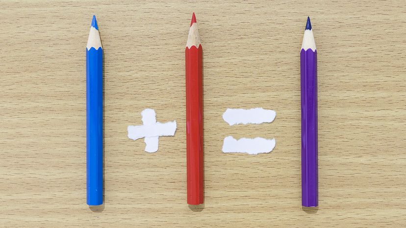
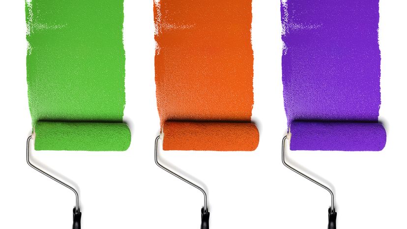
Secondary colors are the superstars that shine when any two of the three primary colors — red, blue and yellow — team up. The results are orange, green and purple. Think of them as the second level of the color wheel. In art class or any creative field, these hues are essential for building a full spectrum of colors.

What makes secondary colors so exciting is how they bridge the gap between the primary and tertiary colors. They bring balance to any design, whether you're mixing colors for a painting, designing a color palette, or crafting a digital masterpiece.

Advertisement

How Do You Make Secondary Colors?

When you combine two primary colors, you get a secondary color. Here are the color combinations.

  • Blue and red create purple
  • Yellow and red create orange
  • Blue and yellow create green

Advertisement

The Science Behind Secondary Colors

Colored pencils arranged as a math equation
Mixing blue and yellow gives you the secondary color green. Karakot Top / Shutterstock

In color theory, secondary colors are formed by mixing two primary colors. This process of color mixing is fundamental to understanding the color wheel and how colors relate to each other.

On the RGB color wheel, which is used in digital design, the secondary shades are cyan, magenta and yellow. These colors emerge from mixing light rather than pigments, showing how the color spectrum changes in different contexts.

Advertisement

Whether in the world of paint or pixels, secondary colors add depth and variety to any color palette.

Secondary Colors in Interior Design

Colored pencils arranged as a math equation
Mixing yellow and red gives you the secondary color orange. Karakot Top / Shutterstock

Interior designers love using primary and secondary colors to create color harmony and depth. A green accent wall or a violet sofa can serve as a dominant color in a room, adding energy or calm, depending on the color temperature.

Warm colors like red orange bring vibrancy to living spaces, while cool colors like blue green evoke a serene atmosphere.

Advertisement

Secondary colors often act as bridges between primary colors and tertiary colors in a room's design. For example, a room with primarily yellow furniture can be complemented by red orange accents to create a cohesive yet dynamic look.

By balancing warm and cool tones, secondary colors ensure that the design feels both lively and harmonious.

Advertisement

Secondary Colors in Fashion

Colored pencils arranged as a math equation
Mixing blue and red gives you the secondary color purple. Karakot Top / Shutterstock

In fashion, secondary colors bring boldness and versatility to any wardrobe. An orange dress or red scarf instantly makes a statement, while blue or green accessories can add a cool, sophisticated touch. Secondary colors pair beautifully with primary and tertiary colors, making them a staple in any stylish outfit.

Color combinations like violet and green create striking contrasts that draw attention, while red or orange paired with muted tones offers a balanced, elegant look. The ability to mix colors and play with color temperature makes secondary colors ideal for creating outfits that are both trendy and timeless.

Advertisement

Secondary Colors in Branding and Marketing

Brands use secondary colors to stand out and convey specific emotions. A green logo can signal energy and growth, while orange evokes warmth and enthusiasm.

In marketing, secondary colors help create eye-catching designs that draw viewers in. For instance, violet can add sophistication to a tech brand, while yellow highlights a playful, approachable vibe. By incorporating secondary colors into their color palette, brands can achieve color harmony that resonates with their target audience.

Advertisement

Secondary Colors in Digital Products

Digital products rely on secondary colors to create visually appealing interfaces. On the RGB color wheel, cyan, magenta and yellow are crucial for adding vibrancy to websites and apps. These colors can act as accent colors or dominate the design, depending on the intended mood.

Tertiary colors like blue-green and red-violet are also often used to highlight interactive elements, such as buttons or navigation bars. The mix of warm and cool colors ensures that the design remains engaging while maintaining balance.

Advertisement

Pairing Secondary Colors With Tertiary Colors

Secondary colors often pair beautifully with primary and tertiary colors. For example, blue-violet complements yellow-orange, creating a striking contrast, while yellow-green pairs well with blue and red for a more harmonious look. These color combinations are perfect for adding depth and interest to any design.

Some classic pairs include red-orange and blue-green (which balance warmth and coolness), and red-violet with primary yellow, (which adds a playful yet sophisticated touch). By exploring the relationships between primary, secondary and tertiary colors, designers can create endless possibilities for vibrant, cohesive designs.

Advertisement

We created this article in conjunction with AI technology, then made sure it was fact-checked and edited by a HowStuffWorks editor.

Advertisement

Advertisement

Loading...