How to Use Neutral Colors for Sophisticated, Understated Looks

By: Ada Tseng  | 
Mixing different textures can add depth to a neutral palette. Followtheflow / Shutterstock

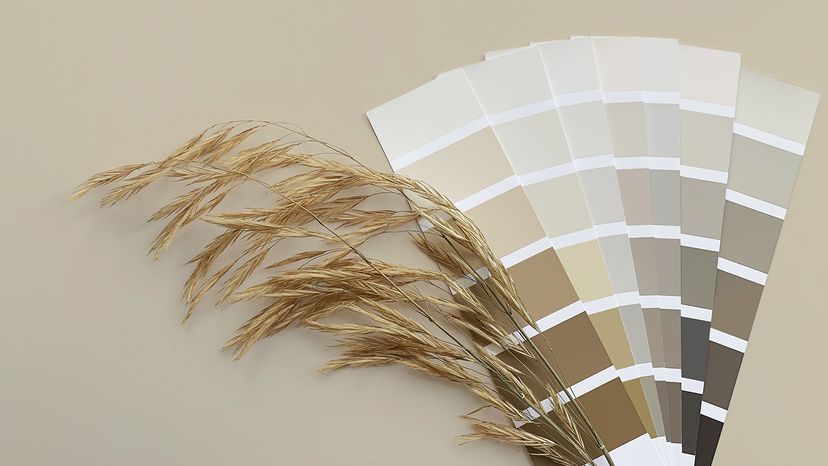
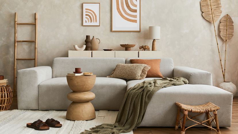
You know what's great about neutral colors? They complement everything. Sure, neutral colors might not scream for attention like neon colors, but they're the backbone of design and style.

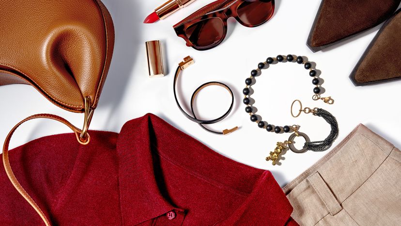
Neutral hues like white, gray, beige, cream and black (and even navy and blush, depending on their undertones) exude understated elegance. Whether you're designing a room, choosing a wardrobe or building a brand, neutrals are the perfect foundation.

Advertisement

Plus, they come in many shades and undertones, and they can add subtle warmth or coolness even without a strong hue.

Neutral Colors in Interior Design

neutral-colored paint chips with a piece of straw
Sticking with neutral colors for most of your decor can help other colors pop in fun and visually interesting ways. Alina Kovalova / Shutterstock

Interior design relies heavily on neutral tones to create elegant and inviting spaces. A room with neutral walls acts as a canvas for pops of bold or dark colors.

Neutral colors can also create a sense of depth and dimension in a space when combined with a variety of textures and materials, like wood or fabric.

Advertisement

Warm neutrals (like cream, beige or brown) can add comfort. Cool neutrals (gray and blue-tinted whites) can bring a calming effect. Dark neutrals (like charcoal gray or navy) can anchor a space, signaling seriousness and sophistication.

Neutral Colors in Fashion

clothes
A neutral wardrobe can maintain a sense of elegance while allowing elements like a red top to add warmth and a pop of flare. Iryna Veklich / Getty Images

Neutral colors are the unsung heroes of fashion. A beige trench coat, gray blazer and navy sweater are wardrobes staples for many because of their versatility.

Accessories in dark neutrals, like black boots or a brown leather bag, can complement any outfit without overpowering it. Neutrals are also perfect for layering, as they allow assorted fabrics, unique textures and bolder colors to stand out.

Advertisement

But neutrals can also be the stars of fashion. Trends like minimalism and quiet luxury are characterized by simple shapes and neutral colors. The Row — the luxury fashion brand founded by Mary-Kate and Ashley Olsen — is known for its minimalist aesthetic, with collections dominated by beige, cream, white, black and gray.

Neutral Colors in Branding and Marketing

In branding and marketing, neutral tones can convey elegance, reliability and timelessness. A brand with a gray and ivory color palette can exude sophistication, while warm neutrals like beige and brown can add an approachable, earthy vibe.

Neutrals also create contrast if you need to draw the consumer's eye to key elements, like logos or calls to action (CTAs).

Advertisement

Neutral Colors in Digital Products

Digital products often use neutral colors to create clean, user-friendly interfaces. This is not only an aesthetic choice, but a functional one. Neutral tones help maintain focus and readability, ensuring the design doesn’t overwhelm the eye.

Advertisement

6 Common Neutral Color Palettes

There are many classic pairings of neutral colors. Here are some examples.

  1. Gray and beige are clean colors that balancing cool and warm tones. A grey car with beige interior is a popular choice for automobile owners.
  2. Black and white offer high contrast and timelessness. Think of the logos for brands like Nike, Apple and Adidas.
  3. For a softer palette, try ivory with blush, a graceful combination for a bride on her wedding day.
  4. Darker neutrals add depth and sophistication, especially when paired with lighter tones. Think of designer purses that are black or dark brown with lighter neutral accents.
  5. Brown and green neutrals bring an earthy feel. Brands like Whole Foods and Starbucks use this color combo to emphasize their connection to farms and agriculture. Activewear companies like Timberland, Patagonia and R.E.I also often feature brown and green tones to connect their brands to nature.
  6. Tech companies often use a gray and neutral blue combination, which can signal dependability and modernity. Think of logos of companies such as LinkedIn, Dell, Vimeo and IBM.

We created this article in conjunction with AI technology, then made sure it was fact-checked and edited by a HowStuffWorks editor.

Advertisement

Advertisement

Loading...