Split Complementary Colors Will Unleash Your Creativity

By: Kimberly Olson  | 
Split complementary color schemes can add simultaneous variety and cohesion to your interior design plans. Silver Place / Shutterstock

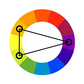
Split complementary colors are the perfect mix of contrast and harmony, offering a dynamic twist on the classic complementary color scheme.

Instead of pairing two colors directly opposite each other on the color wheel, a split complementary color scheme uses one base color and the two colors adjacent to its complement. The result? A vibrant, eye-catching palette with less visual tension than traditional complements.

Advertisement

Pairing split complementary colors offers you the contrast of complementary colors while introducing a touch of balance and nuance. The color harmony is both bold and versatile, making split complements a favorite of artists, designers and anyone who loves experimenting with color combinations.

The Science Behind Split Complementary Colors

Split complementary color wheel. Vector flat outline icon illustration isolated on white background.
Split complements on a color wheel.
Oleksandr Panasovskyi / Shutterstock

In color theory, split complementary colors are derived by selecting a base color and then choosing the two colors adjacent to its direct complement.

For example, if yellow-green is the base color, its split complements are violet and red. This setup creates a trio of colors that balance vibrant contrast with harmonious undertones.

Advertisement

Split complements combine the dynamic interplay of primary, secondary and tertiary colors. By adjusting color values and mixing shades, you can achieve subtle variations that enhance the overall palette.

How Split Complementary Colors Work in Interior Design

Interior designers use split complementary color schemes to create spaces that are both lively and inviting. For instance, a living room with yellow-orange walls might incorporate blue-green furniture and red-violet accents for a balanced yet striking look. This approach allows for strong contrast without overwhelming the space.

Pairing split complements with an analogous color scheme can soften the palette further. For example, adding yellow-green and blue-purple to a room creates depth while maintaining a cohesive flow.

Advertisement

By tweaking color values and integrating complementary elements, split complements bring vibrancy and sophistication to any interior.

Split Complementary Colors in Fashion

In fashion, split complementary color combinations are perfect for crafting bold and balanced outfits. A dress in blue-violet paired with yellow-orange accessories achieves a stunning contrast, while a red-orange jacket worn with a blue-green scarf offers a fresh, eye-catching look.

These schemes allow for versatility, as you can mix and match primary and tertiary colors to create unique ensembles. For example, combining yellow-green pants with a red-violet blouse and blue-green shoes brings a daring creativity that somehow works in your wardrobe.

Advertisement

By experimenting with color values and layering, split complements offer endless styling possibilities.

Split Complementary Colors in Branding and Marketing

Brands love split complementary color schemes for their ability to grab attention without looking tacky. A logo using blue-green, yellow-orange, and red-violet is both dynamic and harmonious, appealing to viewers without being too jarring.

In marketing campaigns, split complementary palettes can highlight key elements and draw focus. For example, a website banner featuring blue-violet as the dominant color, with yellow-green and red-orange accents, ensures an engaging and visually pleasing design.

Advertisement

These eye-catching schemes help brands stand out while maintaining professional and polished aesthetics.

Split Complementary Colors in Digital Products

Digital designers rely on split complementary colors to create interfaces that are both functional and visually appealing. Split complements work particularly well in apps and websites, where clarity and engagement are key.

By using tertiary colors like yellow-orange or blue-purple in split complementary schemes, designers can achieve strong contrast without overwhelming users. Adjusting the color value of each hue ensures accessibility and usability, making digital products more effective and aesthetically pleasing.

Advertisement

3 Split Complementary Color Examples

color wheel showing split complements
Spit complementary colors entail one primary color and two secondary colors. This relationship is easiest to grasp when looking at a color wheel. Masarrat Bano / Shutterstock

Some classic examples of split complementary color schemes include:

  1. Yellow-green, red-violet and blue-violet: A vibrant yet balanced trio ideal for playful and artistic designs
  2. Yellow-orange, blue-green and red-violet: A dynamic combination perfect for warm, inviting aesthetics
  3. Red-orange, blue-purple and yellow-green: A striking palette with a touch of warmth and sophistication

We created this article in conjunction with AI technology, then made sure it was fact-checked and edited by a HowStuffWorks editor.

Advertisement

Advertisement

Loading...