6 Tertiary Colors in Graphic Design, Fashion and Decor

By: Talon Homer  | 
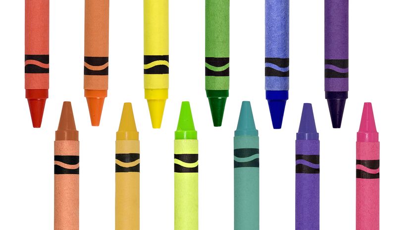
The vast majority of crayons come in tertiary colors. Charles Brutlag / Shutterstock

Tertiary colors are where the magic of color mixing truly shines. These hues are the bridge between primary and secondary colors, creating a dynamic and vibrant spectrum.

What makes tertiary colors so exciting is how they're formed. By combining a primary color and a secondary color in an equal mixture, you get intermediate colors that expand the range of the color spectrum.

Advertisement

What Are the Tertiary Colors?

Tertiary colors include six unique shades.

  1. Red-orange
  2. Yellow-orange
  3. Yellow-green
  4. Blue-green
  5. Blue-violet
  6. Red-violet

Advertisement

Filling the Color Wheel

In color theory, tertiary colors are created by mixing one primary color with a neighboring secondary color on the color wheel. For example, mixing red (a primary color) with orange (a secondary color) creates red-orange, while blue and green combine to form blue-green.

On the RGB color wheel, which is used for digital design, tertiary colors are formed by adjusting the balance of primary and secondary colors of light. These colors are vital for creating smooth transitions and nuanced color palettes.

Advertisement

Tertiary color schemes can work with complementary colors, analogous color schemes or even tetradic color schemes to create stunning designs.

There are three secondary colors we can create by mixing different combinations of the three primary colors. Then there are six possible tertiary colors we can create in further mixing.

The 12 resulting colors make up the broad strokes of what we consider visible color, but there are also infinite possible combinations in between these 12 shades which artists and designers may consider for their works.
Advertisement

Tertiary Colors in Interior Design

532839914

Interior designers love tertiary colors for their versatility and ability to add depth. A turquoise accent wall can bring calm and sophistication to a room, while yellow-orange cushions add warmth and vibrancy.

Advertisement

These colors often act as the perfect balance between warm and cool colors, making them a natural fit for a harmonious space.

Tertiary color schemes can be used to tie together a room with a dominant color while incorporating complementary or analogous elements. For example, red violet decor paired with indigo accessories creates a cohesive yet dynamic look.

Advertisement

Tertiary Colors in Fashion

2155004366

In fashion, tertiary colors are a go-to for creating unique and sophisticated looks. A red-orange coat paired with blue-green shoes is both bold and stylish, while yellow-green accessories can add a pop of energy to a neutral outfit. Tertiary colors bring a sense of individuality and flair to any wardrobe.

Advertisement

These intermediate colors also work well in color combinations for seasonal trends. Cool colors like blue-violet are perfect for winter collections, while warm colors like yellow-orange dominate summer styles.

Tertiary Colors in Branding and Marketing

Brands use tertiary colors to create distinct identities and convey nuanced emotions. A logo in yellow-green suggests freshness and vitality, while red-violet evokes creativity and sophistication. Tertiary colors help brands stand out by offering a unique twist on traditional primary and secondary colors.

In marketing, these colors are often used in analogous color schemes to create visually pleasing designs. For example, a yellow-orange background with accents of red-orange and yellow-green creates a warm and inviting feel.

Advertisement

Tertiary Colors in Digital Products

Digital products benefit from tertiary colors by incorporating them into user-friendly and engaging interfaces. A blue-violet button or a yellow-green notification banner can grab users' attention without overwhelming the design. These colors work especially well in gradient backgrounds, adding depth and vibrancy to digital screens.

On the RGB color wheel, tertiary colors play a crucial role in creating smooth transitions between primary and secondary hues. Tertiary color schemes can be used to highlight interactive elements, guide user focus or add a sense of playfulness to apps and websites.

Advertisement

We created this article in conjunction with AI technology, then made sure it was fact-checked and edited by a HowStuffWorks editor.

Advertisement

Advertisement

Loading...