Why do movie posters look so much alike?

A woman walks past movie posters at a movie theater.
How many cliches can you spot in these movie posters?
PETER PARKS/AFP/Getty Images

Stroll down the halls of your favorite movie theater, and you may find yourself wondering why every poster in sight seems to be advertising the exact same movie. Take a closer look, though, and you'll spot subtle differences that reveal that these look-alike posters are actually designed to showcase completely different films.

It's no secret that Hollywood loves its sequels and franchises, its reboots and re-releases. While Tinseltown is clearly set on rehashing classic film ideas, the same is true for movie poster designers, who seem to stick with a handful of tried-and-true designs. Any idea that meets with even a glimmer of success is quickly copied and reused, again and again. (Think 3-D technology after "Avatar.") Call it the bandwagon effect, or call it desperation to recapture some of the hundreds of millions spent to make a major picture. In Hollywood, if it ain't broke, they don't fix it.

Advertisement

Once you start paying attention to movie posters, you'll find that the majority rely on the same cliches to catch your eye. Every new release may leave you thinking you've seen that poster before -- that's because you probably have. Read on to learn about some of Hollywood's favorite movie poster formulas and to understand more about why these tired tricks may actually convince you to see a movie you might have normally skipped.

Color Theory at the Movies

A person walks past "Star Trek Into Darkness" movie posters.
The orange-and-blue color scheme is so overused in movie posters because the complementary colors create eye-catching contrast.
Ethan Miller/Getty Images

Every movie poster starts with a color scheme, and modern poster designers choose colors designed to catch your eye. Unfortunately, too many of these designers choose the exact same colors, resulting in posters that look suspiciously alike.

Need proof? Next time you head to the movies, count how many posters rely on a combination of orange and blue to sell you on a movie. Once you start looking, you'll find this pair of colors everywhere, from "The Incredible Hulk," to "Night at the Museum" to "The Bourne Identity." [source: Barackman].

Advertisement

But why do so many posters feature this same orange and blue pairing? It all goes back to color theory and the good ol' reliable tool of designers, the color wheel. On a color wheel, colors that sit directly opposite one another are natural complements. Placing complementary hues like orange and blue in close proximity provides the perfect level of contrast to draw your attention to a particular film [source: Duarte].

The popularity of orange and blue lies in the fact that many other color combinations are already associated with something in our minds. Red and green clearly evoke thoughts of Christmas -- which won't work for most films -- while shades of blue and pink are too closely aligned with babies to work well with most movie posters [source: Barackman]. When it comes to the romantic comedy, white backgrounds rule thanks to the light, good-natured feelings they evoke.

Designers looking to be different might want to check out violet and yellow, which also sit opposite one another on the wheel yet aren't commonly found on movie posters. Designers could also turn to another combination -- the black, white and orange trifecta used on a large number of action films [source: Barackman]. Orange means plenty of explosions, right?

Before you find yourself being too hard on poster makers, consider that it could very well be your own preferences for certain genres that are driving movie poster color selections. In 2012, engineer Vijay Pandurangan proved definitively that movie posters have grown both darker and bluer over the past century. Why the decrease in brighter hues? It could be due to a demand for thrillers and action flicks, which tend to require darker, more "masculine" shades [source: Miramax].

Obviously, it's not just color that's causing movie posters to look alike. Read on to discover how a handful of similar images and poses dominate box office artwork.

Same Pose, Different Film

A woman poses for a photo in front of a "Fifty Shades of Grey" movie poster.
The classic man-cradles-woman's-head pose, made trite by Nicholas Sparks's film posters, perpetuated by "Fifty Shades of Grey" poster designers.
MARK RALSTON/AFP/Getty Images

If you thought movie poster designers were colluding on color, wait until you see just how often the same images get recycled. If you pay attention on your next few trips to the theater, you'll find that the images used on movie posters tend to fall into one of just a half a dozen or so tired categories. It's as though the studios spin a wheel to decide what pose the stars will take on the marketing materials for a movie.

Don't believe it? Consider the classic back-to-back pose between the film's stars on the posters for "Pretty Woman." You've seen it more than once since then; think "How to Lose a Guy in 10 Days," "Ghosts of Girlfriends Past," "Four Christmases," "Laws of Attraction" ... the list goes on. Since "Pretty Woman" hit it big, the classic back-to-back pose has become practically a requirement for the rom com. Studios continue to reuse this pose, hoping you'll make associations in your head between "Pretty Woman" -- a major hit -- and whatever light-hearted comedy the studio is trying to convince you to see at the time. The pose is familiar and may make you more likely to see a film you may normally have skipped [source: Plumb].

Advertisement

Of course, the commitment to the standard image doesn't stop with romantic comedies. Making a poster for an action flick or thriller? You've obviously got to stick to the required image of the film's hero running through the streets, preferably at an angle, and oh, don't forget to give the entire poster a blue tint. This formula is sure to make the public associate your movie with successful ones in the genre such as "Taken," "Body of Lies," "The Firm" or "The Happening." All of these films relied on the same, nearly interchangeable movie poster [source: Barackman].

When studios run out of ideas for marketing a movie, many rely on the old adage "sex sells" and plaster the image of a star's head across the entire poster. For an even more conspicuous version of this trick, consider the posters dominated by a fine set of female legs, often with some sort of scene from the movie playing out in miniature between a set of sky-high heels.

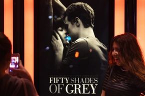
Finally, consider the romantic drama -- or every Nicholas Sparks film ever. Put the posters for these movies side by side, and you'll see the same image repeated with a different set of stars: The male lead cradles the female's head in his hands and goes in for the kiss [source: Smith]. Bonus points for a beach or a sunset somewhere in the background.

Sure, Hollywood has the bucks to invest in cutting-edge posters that are ripe with originality, but as long as the same old images keep filling seats, movie studios have little motivation to move beyond the classic color schemes and poses so familiar to modern movie fans.

Lots More Information

Related Articles

  • Albertson, Eric. "Cinematic Color Choices." Duarte. June 24, 2010. (Aug. 22, 2014) http://www.duarte.com/blog/cinematic-color-choices/
  • Barackman, Nola. "Why Movie Posters All Look the Same." The Wrap. Feb. 4, 2013. (Aug. 22, 2014) http://www.thewrap.com/movies/blog-post/why-movie-posters-all-look-same-75846/
  • Ferro, Shauncey. "The 9 Biggest Cliches in Movie Posters." Fast Company. Date Unknown. (Aug. 22, 2014) http://www.fastcodesign.com/3024412/the-9-biggest-cliches-in-movie-posters
  • Miramax. "Visual: Movie Poster Color Schemes, From 1914 to 2012." June 19, 2012. (Aug. 22, 2014) http://www.miramax.com/subscript/movie-poster-color-schemes-graphic-visualization/
  • Plumb, Alastair. "The 7 Romantic Comedy Movie Poster Cliches." Empire Magazine. 2011. (Aug. 22, 2014) http://www.empireonline.com/features/romantic-comedy-movie-poster-cliches/p1
  • Smith, Grady. "The New Safe Haven Poster Reminds Us Of Something." Entertainment Weekly. Oct. 26, 2012. (Aug. 22, 2014) http://popwatch.ew.com/2012/10/26/safe-haven-poster/