How Illustration Works

Leonardo Da Vinci's Mona Lisa and A Haddon Sundblom Santa illustration

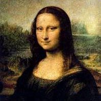
When Leonardo Da Vinci finished "The Mona Lisa," he had created a masterful work of art that stands on its own. Today the painting hangs in the Louvre in Paris and is known around the world.

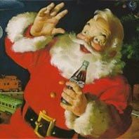
But what if Leonardo lived today? What if he had painted "the Mona Lisa" for an advertising agency as a background for a magazine ad? In that case, the Mona Lisa would be an illustration. The illustration might still be well known and influential. For example, our common conception of Santa Claus comes in large part from a set of paintings by Haddon Sundblom, used as illustrations for Coca-Cola ads between 1931 and 1964. It is quite possible that Sundblom wouldn't have made the paintings, nor that they would be as widely known, if they had not been ad illustrations.

Advertisement

Leonardo Da Vinci's Mona Lisa and A Haddon Sundblom Santa illustration

As you can see, the line between fine art and illustration is often blurry, but there is a distinction. In the dictionary, one definition of illustration is, "visual matter used to clarify or decorate a text." An illustration is art, but the art is serving as part of a larger whole rather than standing on its own.

We see illustrations all around us in countless different forms and formats. For example, most children's books are illustrated. Catalogs, books and magazines often contain illustrations. Most user's manuals have illustrations, though they may be crude. The Sunday comics are illustrated cartoon panels, as are comic books. Many ads on billboards and in magazines are illustrated. One way to think of an illustration is as a drawing, photograph or painting that serves a specific purpose in some larger work.

Art from the Hildebrandt brothers' popular Tolkien calendars.
Illustration courtesy Spiderwebart

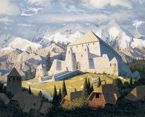
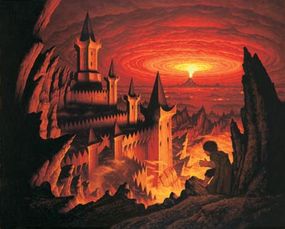
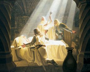
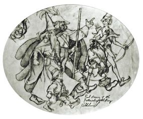
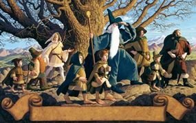
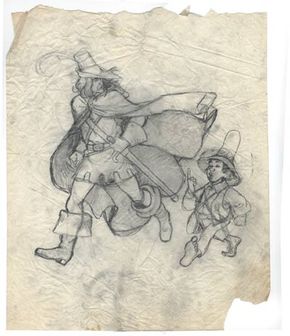
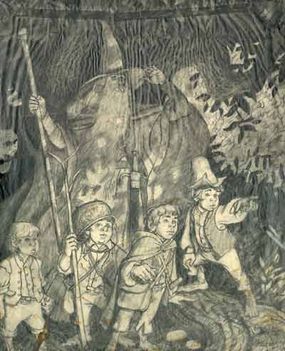
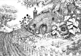
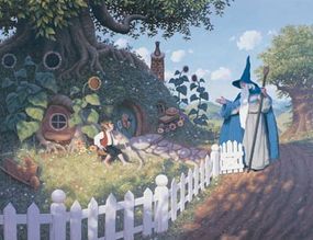
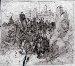
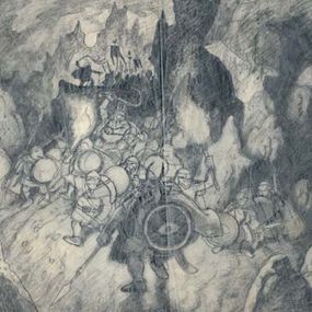
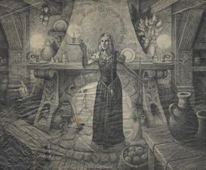
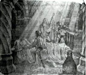
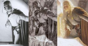
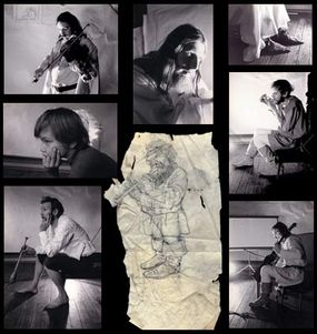
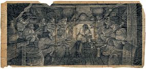
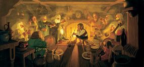
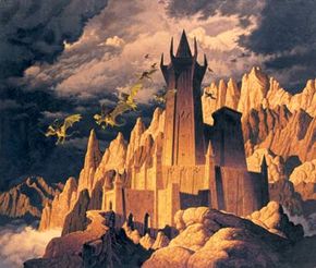
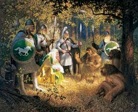
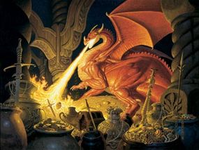
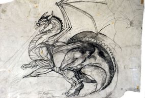
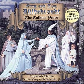
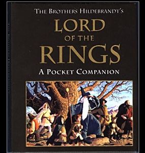
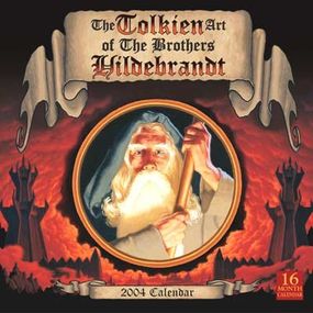
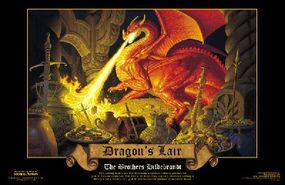
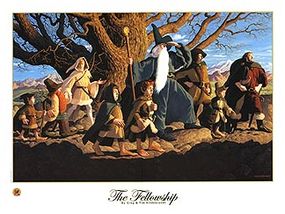
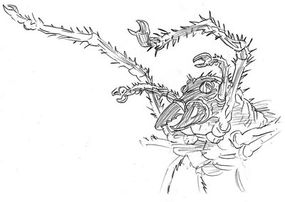
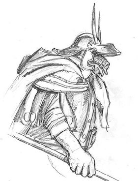
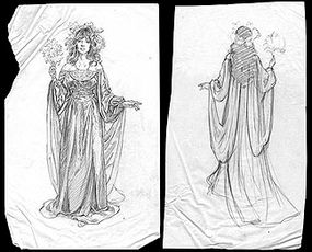
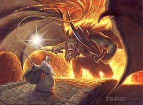
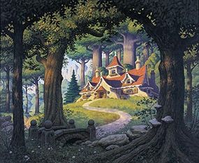
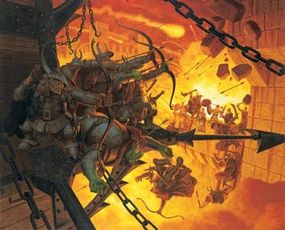
In this article, we'll look at a pair of illustrators and their very special form of illustration. Greg and Tim Hildebrandt, also know as The Brothers Hildebrandt, have been creating illustrations for several decades. They are probably best know for a set of large, elaborate paintings that they created in the 1970s to illustrate three J.R.R. Tolkien calendars published by Ballantine Books (at the time, the world's best selling calendars ever). They also created movie poster for the first "Star Wars" movie, and a wide range of other works. Their careers have spanned everything from children's book illustrations to racy pinup art. We will see how illustration works through their eyes.

Advertisement

Getting Started

Illustration courtesy Spiderwebart

J.R.R. Tolkien created several of the most popular books ever written -- "The Hobbit" and "The Lord of the Rings" trilogy. Those books paint their scenes using words -- text descriptions that are extremely detailed and vivid. Greg and Tim Hildebrandt, as illustrators, have the job of taking those text descriptions and bringing them to life in images. The process that they use to create such detailed paintings is fascinating.

The Hildebrandts' vision of Tolkien's world
Illustration courtesy Spiderwebart

But first, the brothers had to get the gig.

Advertisement

One part of illustration is the fact that a lot of illustration is commissioned work. Someone needs an illustration -- an ad agency, a publisher, a magazine editor, etc. -- and is willing to pay to have the illustration created by an artist.

In the case of the J.R.R. Tolkien calendars, the person with the money was Ian Summers, the art director for Ballantine Books. He needed a set of 14 illustrations for the 1976 Tolkien Calendar. Ian describes the scene of his first meeting with the Brothers Hildebrandt in this way:

In the reception area stood a pair of identical twins, bearded, wet (it was a snowy day in February), with paint-covered jeans, thick eyeglasses, and a kind of endearing attitude. I searched for their portfolios. There were only two dark-green plastic garbage bags in the corner, seemingly left behind by the night crew.

I suggested that they come back when they had their portfolios with them and to make an appointment. One of them said, "Hey, man. Pictures. Tolkien pictures. We make 'em."


Each reached for a garbage bag and emptied it onto the reception room floor. Greg was on his knees smoothing out crumpled pieces of vellum with exquisite pencil drawings based on "The Lord of the Rings." I was enthralled. One might say my jaw dropped. I had been searching for unique artists to create the Tolkien calendars. I knew I had found them... Within a week, papers were signed and I had commissioned the brothers to create fourteen paintings."


[Source: Greg and Tim Hildebrandt, The Tolkien Years]

In the world of illustration, this probably ranks as one of the least orthodox methods for getting a commission, but it worked in this case. The Hildebrandt brothers got a contract and they started to create their illustrations.

Advertisement

Style

With a commission in hand, one of the very first steps in creating an illustration is deciding on the "style" of the work. In many cases the person offering the commission has some specific ideas about the style. In other cases, style is largely left to the artist's discretion.

In either case, deciding on the artistic style of the art involves an understanding of the audience (the age of the audience, for example) and the message the work should send to that audience. For example, an illustration of a car designed for a four-year-old child would certainly have a different style and approach than an illustration of a car designed for an adult, or one designed for an automobile mechanic. Knowing the audience and setting the style for the work is perhaps the artist's most important decision. This decision affects a great number of things in the final illustration. Getting the style right also has a big impact on audience acceptance.

Advertisement

The Brothers Hildebrandt started their careers making documentary films and then went into illustrating children's books, so early on, they had experience creating for two very different audiences. As they started work on their calendar, the brothers spent a good bit of time at the outset deciding on the overall style. They approached this decision by creating a variety of sketches to demonstrate different possibilities. Since they came from the world of children's book illustration, some of their first illustrations had a childish feeling to them. For example, this sample:

An early conception of the Fellowship of the Ring.
Illustration courtesy Spiderwebart

Greg Hildebrandt notes, "This drawing was one of the first we did on Tolkien. Then we decided to take a more realistic, adult approach for the Ring. For six years Tim and I had illustrated Children's books. The Tolkien calendars were the beginning of a new style for us."

By working through a number of sketches and working back and forth with Ian Summers, the group established the overall look of the art. This picture shows the more mature tone typical for the Tolkien calendars.

Illustration courtesy Spiderwebart

This image is the centerfold for the 1976 Tolkien calendar. It is a painting, typically done in a very large format. Some of the Hildebrandt paintings are as large as 6 feet (2 meters) wide. The background, the tree and each character in the scene are exquisitely detailed.

With the commission in hand and the tone established, the actual process of illustration can begin. But first, the illustrators have to work all of those details out.

Advertisement

The Thumbnail Sketch

An early sketch of Aragorn and Frodo
Illustration courtesy Spiderwebart

When a non-artist looks at the elaborate illustration in the last section, the obvious question is "How do you work out all of the details?" For example, how do you decide what will be in the background? How do you decide how each person will be standing? How do you decide on things like facial expressions and arm positions? Hair? Shoes? Hoods? Belts? Weapons? Accessories? These are all details you have to understand before you can start painting.

In the case of the Tolkien illustrations, many of the basic notions and some of the details come from the word-pictures that Tolkien paints. For example, in Chapter 1 of "The Lord of the Rings", Tolkien paints a picture of Gandalf:

Advertisement

At the end of the second week in September a cart came in through Bywater from the direction of the Brandywine Bridge in broad daylight. An old man was driving it all alone. He wore a tall pointed blue hat, a long grey cloak, and a silver scarf. He had a long white beard and bushy eyebrows that stuck out beyond the brim of his hat.

In the forward to the book, Tolkien paints a picture of hobbit architecture:

The craft of building may have come from Elves or Men, but the Hobbits used it in their own fashion. They did not go in for towers. Their houses were usually long, low, and comfortable. The oldest kind were, indeed, no more than built imitations of smials, thatched with dry grass or straw, or roofed with turves, and having walls somewhat bulged. That stage, however, belonged to the early days of the Shire, and Hobbit-building had long since been altered, improved by devices, learned from Dwarves, or discovered by themselves. A preference for round windows, and even round doors, was the chief remaining peculiarity of hobbit-architecture.

The Hildebrandt brothers spent a lot of time interpreting these descriptions and experimenting with various representations.

The original sketch for Gandalf and the hobbits that the Hildebrandt brought to Ballantine books in 1975
Illustration courtesy Spiderwebart
A concept sketch of hobbit architecture
Illustration courtesy Spiderwebart

In addition, Tolkien gave some instruction into the appearance of things after he wrote his books. For example, in a letter to the Houghton Mifflin company in 1938, Tolkien elaborated on the appearance of hobbits:

"I picture a fairly human figure, not a kind of 'fairy' rabbit as some of my British reviewers seem to fancy: fattish in the stomach, shortish in the leg. A round, jovial face; ears only slightly pointed and 'elvish'; hair short and curling (brown). The feet from the ankles down, covered with brown hairy fur... Clothing: green velvet breeches; red or yellow waist-coat; brown or green jacket; gold (or brass) buttons; a dark green hood and cloak (belonging to a dwarf).... Actual size...say about three feet or three feet six inches... But since leathery soles, and well-brushed furry feet are a feature of essential hobbitness, he ought really to appear unbooted, except in special illustrations of episodes."

[Source: "The Letters of J.R.R. Tolkien" p. 35 Letter # 27 to the Houghton Mifflin Company]

This type of word-picture gives the Hildebrandt brothers guidance. So, for example, in a painting that shows Gandalf meeting Bilbo, Gandalf has a pointy blue hat and a long beard, while Bilbo sits in front of a house with round windows and a round door. Bilbo is the right size, has hairy feet and pointy ears.

Bilbo and Gandalf meet
Illustration courtesy Spiderwebart

However, the brothers also have some liberty as illustrators. Tim notes, "When reading Tolkien's text, Greg and I questioned what it would look like if Gandalf's eyebrows stuck out past his hat. We decided not to follow his text literally because his description of Gandalf's eyebrows would have made them almost a foot long."

Given this guidance, there are still thousands of questions for an illustrator to work out. Most importantly, what is the illustration trying to say? What scene does it capture? Who is in the scene? What are they doing? How do they feel? And then there are a myriad of tiny details. For example:

  • Where will the "camera" be? Will it be at eye level with one of the characters? Slightly above? Slightly below? Very low, to increase the drama of the shot, or very high to show a broad perspective? Will the camera be close or far away? The illustrator had to figure all of this out in order to establish the horizon line in a painting.
  • Where will the light be coming from? One source, two sources? Is it a point source or diffuse? Are there leaves dappling the light (as in the illustration above)?
  • What is the light source? Sunlight? Moonlight? Candlelight? Fire light?
  • What is happening in the sky? Blue? Grey? Puffy clouds? Heavy overcast?
  • What time of day or night is it in the illustration?
  • What is the location? Is it an interior scene or an exterior scene?
  • As well as all sorts of other details. For example, fences (new, old, freshly painted or not?), wheelbarrows, flowers, grass (freshly mown, grazed, untouched?)

The Hildebrandt brothers initially work out decisions like these in thumbnail sketches, also known as rough sketches. These are quick, small, rough drawings that allow the illustrator to experiment, try different ideas and work out details in a few minutes.

Illustration courtesy Spiderwebart

Tim makes two points about thumbnails:

  • "Whenever we started working on a new character, we did dozens of drawings. These were quick sketches done without the use of models. Character studies defined movement and personality."
  • "According to Howard Pyle, the grandfather of American illustration, you should sketch a scene fifty different ways and imagine yourself as a part of it, not just as an observer. We have been doing this since childhood."

Having worked out the basics in a series of thumbnails, the next step is a rough comprehensive sketch, or in brief, a rough comp. The drawing technique is still quick and rough, normally done in pencil, and it is larger. But the idea is to include all of the elements of the final illustration and see how they all fit together. The rough comp normally goes to the art director who commissioned the work, for his or her approval.

Advertisement

The Final Layout

Illustration courtesy Spiderwebart

Artists work in all sorts of mediums. If your illustration is going to go onto the comic page of a daily newspaper, then it might be a pen and ink drawing. If it is going in a comic book or the Sunday paper, you would draw it in ink and color it with a computer. Other mediums include charcoal, chalk, pastels and water colors. For the Hildebrandt brothers, the illustrations are almost always done using acrylic paint in a very large format.

The first step to creating a painting is a final sketch, also known as a final layout. These are incredibly intricate pencil drawings, normally the same size as the final painting, that contain all of the details that will go into the finished piece.

Advertisement

Examples of final comps
Illustration courtesy Spiderwebart

To make a sketch like this, the Hildebrandt brothers actually pose real people in costumes and photograph them. The models are lit as they will be in the illustration, because the purpose of these photographs is primarily to understand and recreate the proper pattern of light. Light on a human face or on a piece of fabric is one of the things that can make or break an image that is supposed to be realistic. Tim: "Our method is to create thumbnail sketches, then make costumes and photograph a model in the correct lighting."

From photo to final comp to finished painting
Illustration courtesy Spiderwebart

The other reason for photographing people is to work out things like facial expressions and gestures. By posing a model naturally, or by letting the model "act out" the emotions in the scene, it is possible to capture on film exactly the right mood. Then the expressions and gestures can be transferred to the image of the characters in the final layout.

Model poses
Illustration courtesy Spiderwebart


Final comp
Illustration courtesy Spiderwebart
Finished painting
Illustration courtesy Spiderwebart

Tim points out, "People usually only see the finished product. They don't realize the amount of work that is done before we even start the paintings. We did very elaborate, full-sized pencil drawings for almost all of our Tolkien work. We had to do them this detailed not only for ourselves, but for Ballantine, in order to get their approval and check for inaccuracies."

Advertisement

The Actual Painting

A finished painting depicting the Dark Tower
Illustration courtesy Spiderwebart

Having gone through an immense amount of preparation, Greg and Tim are now ready to begin painting.

The brothers use a unique substrate. Rather than the traditional canvas, they use large sheets of Masonite or Duron, also known as hard board. Masonite and Duron are made from heavily pressed wood fiber material often used to make cabinets and furniture. One side of it is extremely smooth and dark brown. To prepare a Masonite board for painting, the brothers would first paint it with multiple coats of heavily watered-down, thin, white gesso (a mixture of plaster of Paris and glue) and then sand it smooth, so that it has the feeling of an eggshell in terms of texture.

Advertisement

The next step is to transfer the details from the final composition drawing onto this board. The brothers normally do the transfer using homemade graphite paper. A large sheet of paper is coated with soft pencil lead, then soaked in rubbing alcohol and dried. By putting this graphite paper over the gesso and then putting the final layout over it, the brothers can trace out the important features of the final comp. These guidelines make painting much easier.

They generally use an acrylic paint that you would find in tubes in an art store, made by either Grumbacher or Liquitex. It goes on like oil paint but dries much more quickly (acrylic taking minutes to dry, while oil takes days).

Illustration courtesy Spiderwebart
Acrylic paint on canvas
Illustration courtesy Spiderwebart

The brothers mix their paints on a sheet of aluminum foil. Typically, they start by mixing the various values and shades of color, from the lightest value to the darkest value, for the parts of the scene that is farthest away. In an outdoor scene, these would normally be the colors for the sky. For an interior scene, they would be the colors for the back wall of the room. Since the sky is lighter at the horizon, the palette of colors mixed on the aluminum foil would offer all of the shades needed to paint the different parts of the sky. Then the brothers work forward, painting closer and closer parts of the scene.

One of the surprising things about the painting process is the amount of time it can take. For example, take this painting:

Illustration courtesy Spiderwebart

Greg points out, "What I remember most about this is how long it took to paint the leaf-mail armor." Imagine painting every leaf in the mail, every blade of grass, every twig and leaf.

Or this one:

Illustration courtesy Spiderwebart

Tim: "I can remember spending nearly a month painting all of the coins and jewels." The fact that these paintings are so large and detailed means that everything takes longer. On the other hand, the size yields incredibly detailed illustrations.

An early sketch of the dragon Smaug
Illustration courtesy Spiderwebart

Ian Summers, who commissioned the Brothers for the Tolkien calendars, points out, "The entire art department rejoiced whenever Tim and Greg brought in their fantastic illustrations... The delivery of each painting was an event... They would create a finished piece of art every two or three weeks."

When you think about the amount of work that went into each painting, that timeframe is absolutely amazing. But it comes with the job. As a general rule, illustrators live and die by deadlines. A gallery artist might have really productive times, with great output, followed by dry spells. Because illustrators are contributing to larger projects, they have to meet deadlines, which means they have to be highly productive whenever they're working. If an illustrator gets a reputation for missing deadlines, it could cost him his career.

In the case of the Hildebrandts, the results speak for themselves. And the calendars were tremendously popular as a result.

Since doing the Tolkien calendars in the late 1970s, the Hildebrandt brothers have worked on a wide variety of projects. They do everything from commissioned works for well-off people who want themselves painted in Tolkien and personal fantasy scenes, to a wide variety of original paintings sold as original artwork or prints.

Greg Hildebrandt's company, Spiderwebart, offers a variety of Hildebrandt prints and original artwork, to fit all budgets. Go to the next section to see some of the available artwork.

Advertisement

The Hildebrandt Catalog

Here is a small sampling of the incredible "Lord of the Rings" books, prints and original artwork available from Spiderwebart. If you're interested in buying something, simply click on the picture to get more information.

If you would like to see more of the Hildebrandt's artwork, click here. Or check out Spiderwebart's holiday sale catalog.

Advertisement

Books and Calendars

"Lord of the Rings: A Pocket Companion," signed by the artists: $6.00
The Tolkien Art of the Brothers Hildebrandt 2004 Calendar: (Advance orders) $13.00

Prints

"The Dragon's Lair" print: $5.00
"The Fellowship of the Ring" lithograph: $35.00
"Pillars of the King" oil on canvas print: $200.00

Original Drawings

Drawing of Shelob, signed by the artists: $225.00
Drawing of an orc, signed by the artists: $325.00
Two-piece drawing of Arwen, signed by the artist: $850.00

Original Paintings

Original painting "The Mines of Moria": $6,000.00
Original acrylic painting, "Rivendell": $35,000.00
Original acrylic painting, "The Siege of Minas Tirith": $165,000.00


Advertisement

Advertisement

Loading...